Arnaud Pontin (Photos : Gay Globe Media)
The launch of a new business card may seem like a trivial gesture for many people and companies. But for Gay Globe, it is a true event. Why?
Because this card will represent us for years to come. We not only embrace the name of our media outlet and what it stands for in an era marked by the erasure of LGBTQ+ identities worldwide under the influence of Donald Trump, but we also embrace what this card represents in terms of journalism and the services we provide to our communities and to the general public.
On a technical level, the artistic design of this new image was created by the Gay Globe team according to current standards. As for its presentation and the materials used, they hold a few surprises.
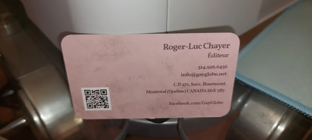
“When we say at Gay Globe that we stand by our choices, that even extends to the base color of the new card. We chose pink, a color often associated—for better or worse—with the homosexual community. It is also a way to pay tribute to those who, in another era, bore the pink triangle,” says Roger-Luc Chayer, publisher of Gay Globe.
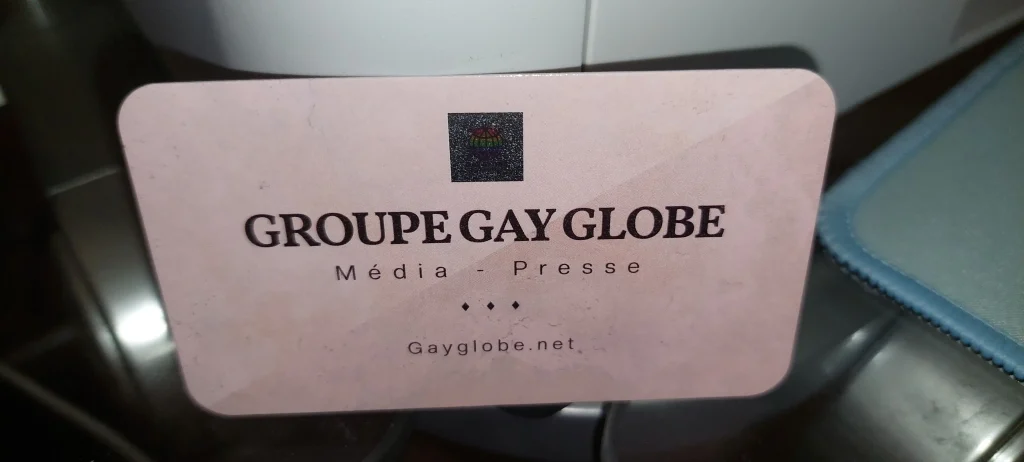
In addition to pink, presented in different shades, the background evokes parchment paper. The card itself, with aesthetically rounded corners, is laminated—so durable that one might even mistake it for plastic. As for the Gay Globe logo—unfortunately not visible in the photo—it features a metallic 3D effect, giving the card the look of a small jewel.
On the reverse side are the addresses and contact details, along with a QR code that leads directly to Gayglobe.net.
For its launch, the card was sent to 150 clients and friends of the media. It is designed to last, resistant to wear and tear, and will not deteriorate even after repeated handling.